Rothko bench
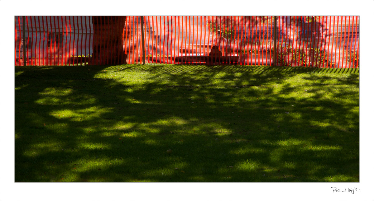
“Rot Dunkelgrün Grün, 1952” – ein Bild von Mark Rothko kam mir in den Sinn. Kräftige Farben, klare Grenzflächen, sich berührende Farbbereiche, ungeahnte Intensität entstehend. Eine Plastik-Absperrung hält eine Rasenfläche frei, die frühherbstliche Sonne malt mit Schatten einen Baum auf das grüne “Zeichenbrett”…
(Pärkchen beim Falkenplatz, Bern)
…………………………………………………………
“Red Dark Green Green, 1952” – a picture of Mark Rothko came to my mind. Vibrant colors, clear boundaries, areas of color touching each other, unexpected intensity arising. A plastic barrier keeps a lawn free, the early autumn sun paints with shadows a nice tree on the green “drawing board” …
(Small park next to the Falkenplatz, Bern, Switzerland)
Yours truly
«» by Series/Category
«» By date

Without reading the commentary, “intense” was the first word that came to mind. Such rich fields of color!
Too, you inspire me to do a fresh study of Rothko’s work. 🙂
Thanks, April. My visit to the Rothko exhibition in the Fondation Beyeler in Basel (Switzerland) was one of those events that changed the way I understand color fields… Emptiness at first sight and incredible richness at second. This shot here is of course no way near the intensity of a Rothko painting, but one might see where I got my ideas about the composition here. 🙂
cheers
®
Ich wüsste nicht, was mir besser gefällt: das Format, das die Querteilung noch unterstreicht? Die Komplementärfarben? Nein, ich glaube, es ist das Schattenspiel, die Lichtmalerei.
Herzlichen Gruß,
Ingrid
Auch hier ein herzliches Danke, Ingrid!
cheers
®